


The story of a reduction linoprint
Part two: printing the first layers

Last week I started this series charting the creation of a reduction linoprint. The first post was the preparatory stuff (if you missed it you can read it here), but now we are on to the juicy bit of actually printing.
The first layer is pale blue but I can’t just slap that on all over. With a reduction print, every layer will be underneath all subsequent layers and so will affect later colours. In this case, the next layer I’m going to print will be a pale ochre, and that will appear green if there’s already blue underneath it. So, I have to make sure blue doesn’t go where I actually want the final colour to be ochre. (With me so far?)
What I have to do is ink up only part of the block, but if I were simply to roll the colour on only one area there would be a hard line at the edge of the ink which would show through all subsequent layers. In the photo below you can see one large roller completely inked up, and a smaller roller which I have run over the ink just on one side. Rolling it back and forth blends the ink out to the un-inked side, so when applied to the block the colour will fade out. This is the same technique as blending two inks on a roller (called a rainbow roll even though it often involves only two colours) but here I am blending one colour with….nothing.
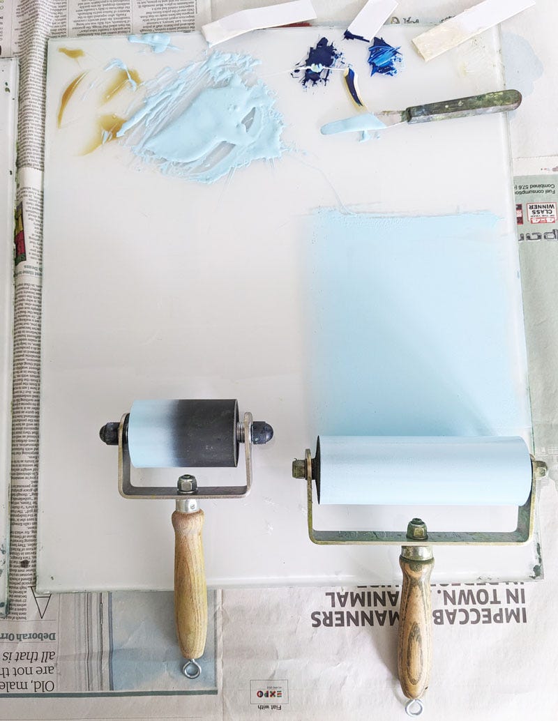
I then use the big roller to ink up most of the area I want to cover, and go carefully along the edge with the smaller roller to create a softened edge like this…
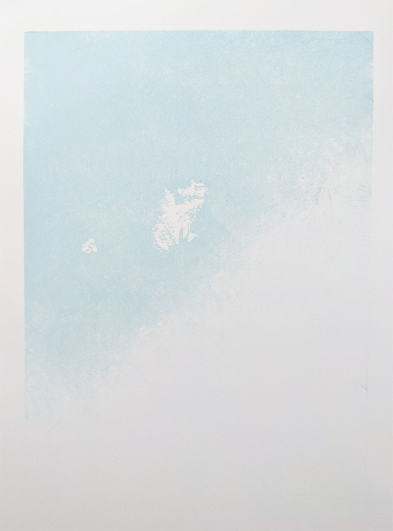
And this is what the print looks like after this first layer of blue is printed. You can see crisp white shapes that I had carved out of the block, and an unprinted area at the bottom (but no hard line).
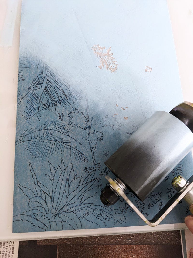
I carve the block further to preserve everything I want to stay blue, and then it’s time to print the ochre layer. This will be printed all over and will come out green where there is already blue ink (which is fine because that’s all going to be green foliage eventually) but will stay ochre further down on the unprinted paper. In fact right at the bottom I want a stronger orange colour so again I use the small roller with a colour blend (rainbow roll) to create that. Here’s how it looks after the second layer.
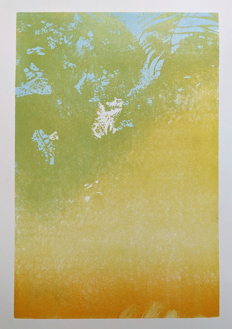
See those smudgy bits at the bottom? I want those to be light green eventually so I’ve wiped away the orangey ink.
That’s that for this week as I don’t want to over-excite you with too many layers. Next I have to carve away anything I want to stay ochre or orange and then print and carve the next layers. I’ll be doing some tree trunks next, just inking part of the block, and then it’s time to really get that foliage going with some bright green all over.
See you next week for part three in this series by which time I will, apparently, be a senior citizen. Good grief.
Jane
PS: Dapple scrumping in action
After I’d prepared this newsletter yesterday I went for a walk; I thought I’d share a bit of it with you. This path runs parallel to the lane where I live and different parts of it have featured in several of my woodland prints like ‘Late August’ and ‘Summer Walk’. It’s looking a bit sorry for itself after a more than month with no rain, but it will soon perk up once the weather changes. (I wish I’d remembered to take an antihistamine yesterday morning - you can hear a bit of wheezing going on….)
Its really fascinating to see how this works - an intriguing blend of creative artistry and mathematics! Looking forward to the next steps