


The story of a reduction linoprint
Part three: the image begins to emerge

In my last post I printed the first two layers of this reduction linoprint and the result was a pleasing abstract blend of colours. I even got the inevitable Twitter comment that it looked fine just as it was*. Well it’s time to put a stop to that and make it look dreadful for a while. I’m going to add the colour for tree trunks and branches next. Quite often these are the darkest details and get left until the last layer of a reduction print, but I’m going in early for a couple of reasons:
There are some quite thin and spindly shapes and given the option it is easier to cut them AWAY now than to have to keep cutting AROUND them in all the remaining layers.
These trunks are not particularly dark so I can get away with printing over the ink.
So here we go. The ink (a mix of burnt sienna, cyan and magenta) looks quite red here but once printed over the existing layers will be more of a purply brown.
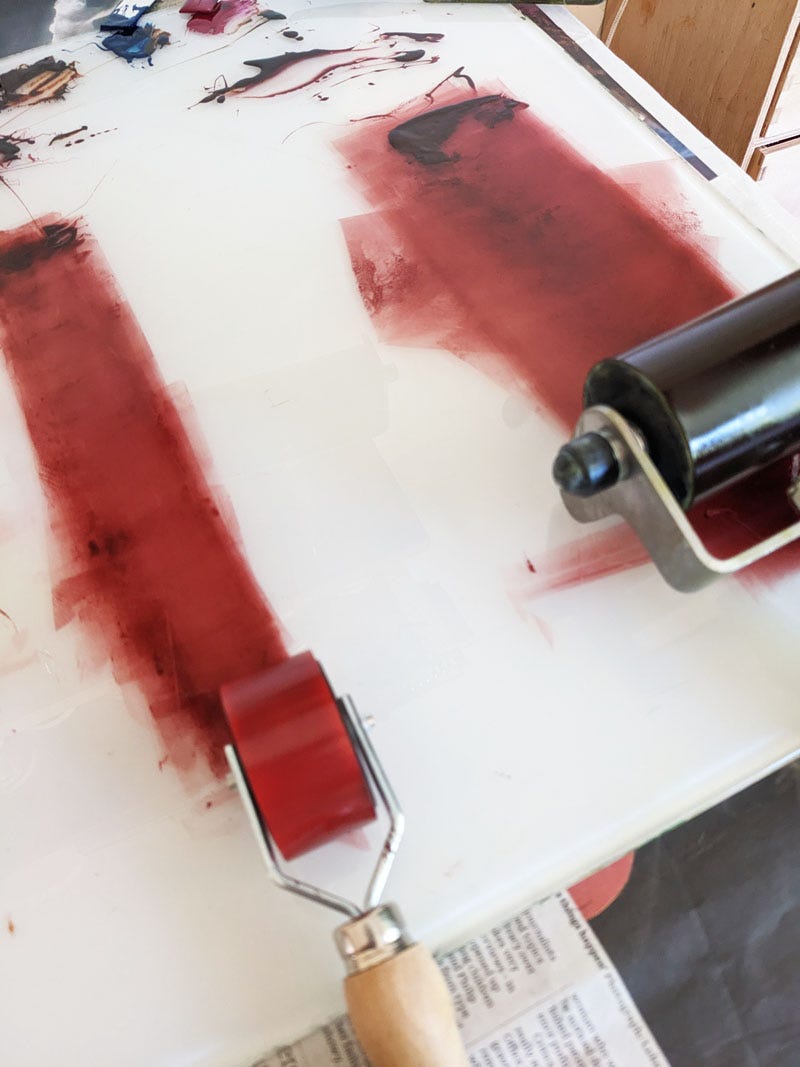
Although I can cover up this colour it still makes no sense to ink the block all over, so I use small rollers for specific areas and wipe paper towel around the shapes to eliminate hard edges which would show through.
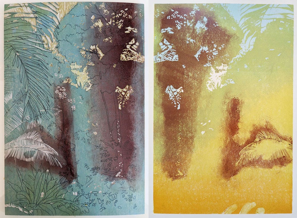
Here’s the inked block (left) and the print after this third layer (right). Looks awful, doesn’t it?
One of the reasons I can get away with printing this now is that the mix for the next layer I put down, a bright fresh green, will include white and process yellow which are both quite opaque, and I won’t add any transparent ink to the mix like I usually do. So having carved away the bits of tree and leaves I want to stay brown, this is the print after that fourth layer of bright green.
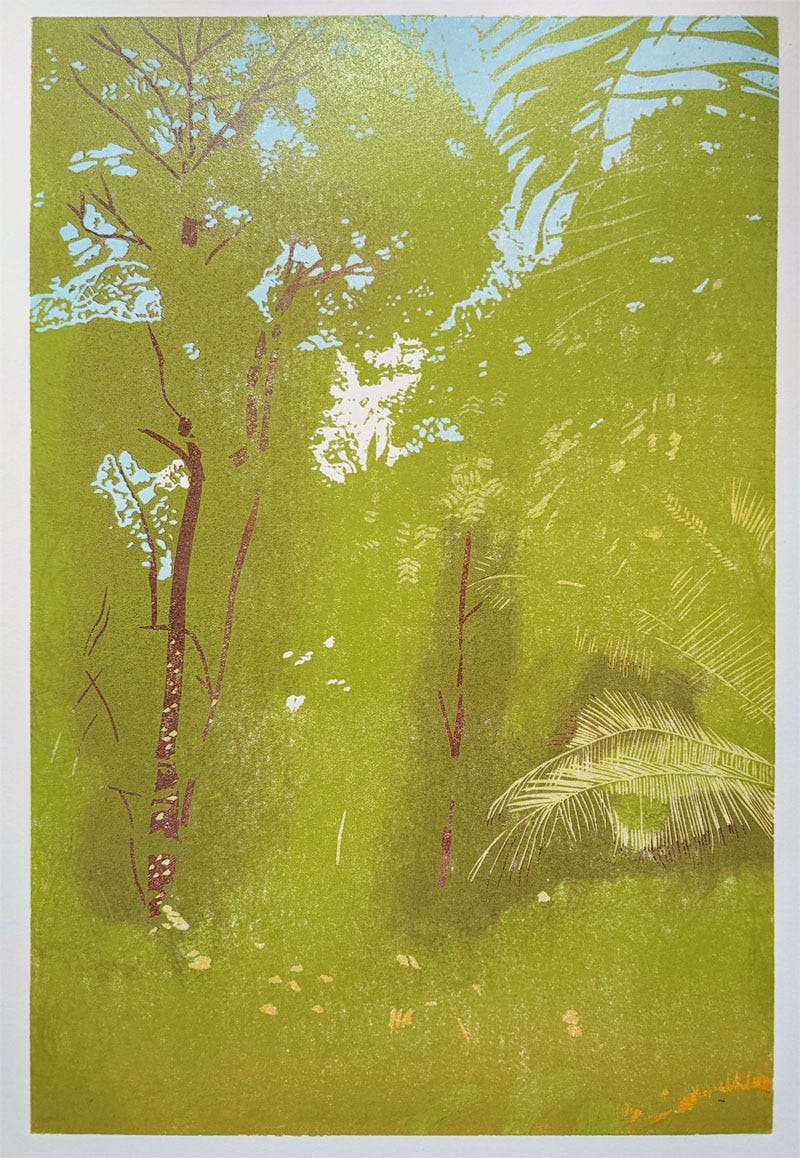
You can still see the dark shapes at this stage but subsequent layers will soften them. In the meantime is the image beginning to make sense? I can see it, but then I have the advantage of knowing where it’s going.
From now on things should theoretically get simpler as I will be printing all over in a single colour at a time, with different shades of green. I’m expecting two or three more layers of green with a final layer of translucent grey for the darkest bits….but I reserve the right to change my mind.
*I didn’t include this frequently heard comment in my post on ‘things not to say to a printmaker’, but please don’t say this about work in progress even if you think you’re paying a compliment. Allow the artist to know what their own work is supposed to look like and when it’s finished.
Woop Woop
That’s not me yelping in excitement; it’s the title of a lovely new conservation magazine which has launched this month. I was delighted and flattered to be asked to contribute to Issue 01 ‘Forest Edition’ and some of my woodland prints feature along with an interview about my printmaking. I say interview, because that’s what it was, with me answering specific questions, but the magazine has taken the interesting editorial decision to print my answers verbatim as separate paragraphs without the questions. As a result it reads like an oddly rambling stream of consciousness peppered with non-sequiturs. If you get your hands on a copy you could try to guess what the questions were…
Still, it’s a really beautiful magazine to look through with some gorgeous photos and interesting articles. And it smells nice too (yes that does matter). If you are interested in reading it for yourself you can order a copy here.
(Note my authentically ink-stained fingernails in this video because I am a proper artist).
See you next time with some more layers on that reduction linoprint.
Jane
It looks like the stage of a project where I say to a client “I know you’re not sure where we’re going so I’m asking you to trust me and suspend disbelief “ I can see the whole “picture “ and I know they will by the end! Having said that, version 3 is a bit surreal